
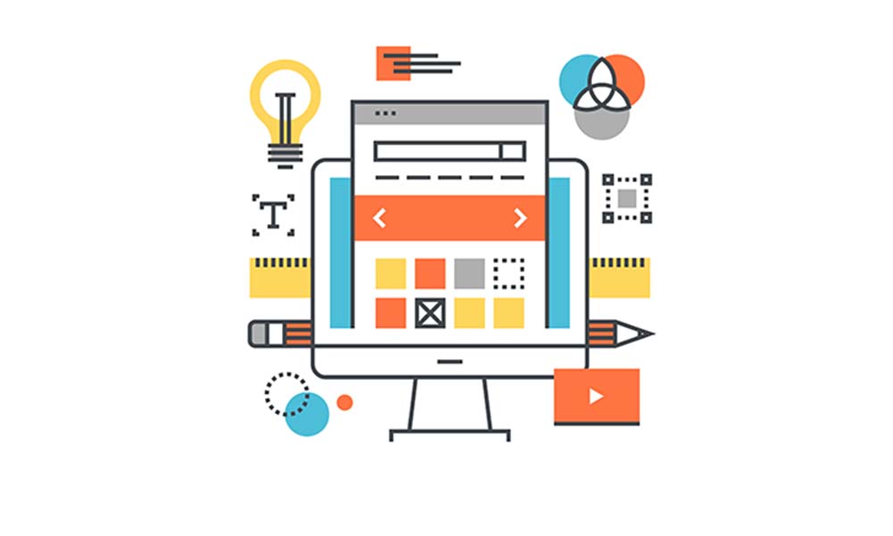
Table of Contents
- Blunder # 1 Mobile ‘Un’ Friendly
- Blunder # 2 Call to Action (Or Lack Of)
- Blunder # 3 Your Business contact information- Phone Numbers and Address
- Blunder # 4 Website Design – Navigation
- Blunder # 5 Website Design – User Interface
- Blunder # 6 Website Design – Content and Layout
- Blunder # 7 Searching for the ‘Search Box’
- Blunder # 8 Broken Links
- Blunder # 9 Slow server and Website Loading
- Blunder # 10 Screen Resolution
- Blunder # 11 Content is King!
- Blunder # 12 Background Music or Just Noise?
- Blunder # 13 Sharing is caring for user engagement- Keep it social!
In the amount of time you read this, there are probably hundreds and thousands of websites being created and launched on the internet right now. Impressive! But in reality, how many of these thousands are actually impressive and do the job that they are intended to do? Contrary to popular belief, whilst anyone can create a website, not everyone can do justice to its true purpose; not just to disseminate information but make your website a true first point of contact for customers with your business? So is your web design impressive and impactful or an example of web design blunders you really should avoid?
Avoid some of these common and simple mistakes to ensure your website makes you stand out and stand apart from the clutter on the internet.
Web Design Blunder # 1 Mobile ‘Un’ Friendly
We start off with the biggest first; lack of a mobile friendly website design. We are all connected nowadays so expecting a mobile responsive web design that adapt to the environment in which it’s viewed, has come to be the benchmark expectation. Users are not just using desktop computers to view websites anymore so having a mobile unfriendly website means ignoring a sizable chunk of your target market and, getting a penalty from Google in the form of lower search rankings. Users are looking for the optimal experience and if you can’t provide this, your competitor can!
Web Design Blunder # 2 Call to Action (Or Lack Of)
Call to Action or CTA, is simply the act of getting your user engaged with your website and ultimately your business, by telling them exactly what to do, where to do it and how to do it. When a user visits your website, what do you want from this visit? Do you want your user to download, subscribe, register, view, share, buy or follow on your website? Make this clear as the day. Don’t let your user get confused about what the objective of your website is, don’t send out ambiguous messages, a user should have a clear idea of your message through your website. Get your website user to jump into action, not ever return to your website because it’s too overwhelming.
Web Design Blunder # 3 Your Business Contact information- Phone numbers and address
When a user is trying to find some basic contact information on your website, don’t make this a game of hide and seek. Earning creditability is harder than earning cash! And with that cold hard fact in mind, your customer shouldn’t have to be the one to work hard to find you. Offer multiple ways for a potential customer to contact you; whether that’s through a simple contact us page or form, phone, email, social media etc. The option to contact you should be readily available to a potential customer on every page of your website to build legitimacy and transparency and even nudge the ‘almost there’ user to engage with your business.
Web Design Blunder # 4 Website Design – Navigation
You have 3 clicks to keep your website user surfing your site and not your competitors! Your website’s navigation should be like a map; seamless, intuitive and consistent allowing a user to determine instantly where they are, the pages they have come from and the pages they want to click to next. Your website navigation should be organised and in theme with your overall website and this can be done with textual descriptions for all links, alt text for images and text description techniques for Flash or Javascript links. There should be a navigation bar on every page that guides visitors to other areas of the site.
Another important yet overlooked flaw with most websites is the lack of changing colours of visited links. The importance of good navigation cannot be undermined, the same applies for visited links that change colour as these offer clarity to a user of the pages they have visited vs. not. Lack of this simple design can create disorientation and frustration with the users repeatedly visiting the same pages over and over again, especially if they are not even relevant pages after all!
Web Design Blunder # 5 Website Design – User Interface
Your website design should be not just fancy but usable too or it’s simply a visually appeasing gimmick! Don’t let excessive creativity work in the favour of your competitor. Your customer shouldn’t feel lost and confused on your website, they should be able to easily perform the actions that they intend to. Make sure there is appropriate usage of navigational components, input controls, informational components and containers so as to make the user interface as user friendly as possible. Designing for the user is the key here.
Web Design Blunder # 6 Website Design – Content and Layout
Your website should be designed with the aim of providing focus, guidance and clear CTA. So the clear rule of thumb here should be the KISS principle; keep it super simple! Less is more when it comes to your website’s content and layout.
Your potential customer is time poor scanning most websites on mobile devices so stay away from inconsistent changes in colour scheme, layout, or sidebar positions. Use consistently maximum 3 different fonts, font sizes, and colours that flow seamlessly and stand out to make the visual experience more exciting. The idea is to communicate stability to your potential customer and build creditability. When choosing colours, fonts and design options, keep in mind how these may look on mobile devices.
Divide your content so your user has a chance to rest their eyes and soak in the information you are providing. Use subpages or archives, group related pages by topics. Make the text scannable and give readers an overview without forcing them to read the entire content. Use appropriate page title for each web page to help users know exactly where they are.
Use HTML and CSS to organise your content which should be accurate, relevant and up to date to avoid SEO disasters. Instead content that flows seamlessly with the overall theme of your website; is unique, informative and fresh content to engage your users and encourage CTA – sharing your content on social media.
A cluttered page with big chunks of texts would only mean darting eyeballs and a fleeting potential customer saying goodbye!
Web Design Blunder # 7 Searching for the ‘Search Box’
Every website should offer its user the option of search. This will save the user precious time of scouring your website for that one piece of information they are after and overall create as positive image of your business in their mind; thus more likely to return to your website.
Web Design Blunder # 8 Broken Links
There’s nothing worse than the feeling of finally finding what you are looking for, clicking on the hyperlink, only to be slapped in the face with a “404” error pages or a link that does nothing. Not only will this leave your website user frustrated and angry, chances are, they are going to hit the back button and press the enter button to your competitors website never to return to you again. Where possible add an option for users to contact the webmaster and report broken links so these can not only be rectified immediately but provide the user with a sense of reassurance that ‘someone’ is there on the other side! Also scan the website for any server errors from time to time, this is a good practice from an search engine optimisation (SEO) point of view as well.
Web Design Blunder # 9 Slow Server and Website Loading
In today’s day and age, this is simply inexcusable. If your website loads slower than a snail’s pace, then time to abandon the fancy JavaScript animations, the latest technology and gimmicks on your site. It’s better than user abandonment of your website with more and more potential customers only being patient for 4 seconds or less. So that’s all the time you got to load and display! Investing in a good server and working with your web designer to optimise the website from a speed point of view are an absolute must.
Web Design Blunder # 10 Screen Resolutions
Sometimes being too ambitious and creative isn’t always a good thing; example having users scroll through your website horizontally, this might sound unique and innovative on paper but certainly not a good idea. Always be mindful of the multiple screens your website will be viewed on. And this is where Google Analytics can be exceptionally helpful in providing insight around user devices and their screen sizes, so that you can be sure what you are designing, actually works for your user.
Web Design Blunder # 11 Content is King!
As previously stressed upon, your website should offer its users fresh, innovative, engaging, creative and really just captivating content so they are hooked and keep coming back for more! Good content will also help you with your SEO as well. Here are some things you can do; Use a mix of keywords (not exact match necessarily) throughout the copy, Meta Descriptions, Title Tags, H1, H2 and H3 headings. Putting these elements on each page will ensure that the user does not ever get lost on your website and knows exactly what a page is about.
Web Design Blunder # 12 Background Music or Just Noise?
This can be a pretty tricky one to master so you best to press the mute button on music! People are different and so are their choices in music and associations they make with different types of music’s. Some of these associations could be psychologically pleasing and thus create a positive emotional response toward your business and website whilst for others; this may touch a sensitive nerve and trigger a negative feeling. So really best to steer away and stay neutral (unless you are in the music business). Moreover this is merely a distraction from the essence of what you are trying to communicate so keep things simple and let people read and visually experience what you are communicating rather than driving them away with the noise.
Web Design Blunder # 13 Sharing is caring for user engagement- Keep it social!
Running a small or medium sized business, you may have a huge competitive advantage over the larger corporation; you are human! People like human, your potential customer will want to know who you are, this will help build creditability and trust and they will engage with your business. Harness this power of being human and put a face to your business through social media platforms. Encourage content sharing on social media platforms by using call to action buttons strategically placed on your website, explicitly displayed and easy to access.
About Us- Websites ‘N’ More is a Sydney based web design agency working mostly with PHP based open source technologies such as WordPress, Joomla, Magento and Drupal. Responsive web design is at the heart of what we do and user-centred designs are what we love to create.
